The Quiz and Survey Master Reporting And Analysis addon allows you to analyze your quiz/survey results using a variety of Charts & Graphs. It allows you to filter data with quiz/survey creation dates, usernames, and categories. You can setup custom charts for each question or view results from all the questions of a quiz/survey, the addon remembers the custom charts you’ve set up and fetches data the next time you visit the page.
You can even show the Quiz/Survey results in the form of a Pie Chart with their % to the users after they submit the Quiz/Survey. And many more useful features.
INSTALLATION/SETUP
Once you have purchased the addon, you will have access to download the addon. To install, simply upload the addon as a normal WordPress plugin. To do so, go to the Plugins page and click Add New. Then, click Upload. From there, upload the zip file that you downloaded when downloading the addon.
Once the addon has been uploaded, you should now have the plugin QSM – Reporting And Analysis listed in your list of plugins. Activate that plugin. Once activated, the plugin will add a new tab on the Addon Settings page labeled Reporting And Analysis.
SETTINGS/CONFIGURE
Before you can use the Reporting and Analysis addon, you must first enter the license key. Without a vaild license key the addon would not work and you won’t have access to the reports & charts.
Adding Your License Key

Enter your license key from your account into the “Addon License Key” field on the “Reporting and Analysis” tab of the “Addon Settings”. Also enter the Chart/Question Title Text limit, by default the value is set to 100.

If your license key is expired you will be shown an error message “License Key Expired” with a link to renew the Reporting and Analysis Addon license.
Now, you can begin analyzing your results. Go to the Results menu that can be found on the WordPress sidebar inside QSM and click on the Reporting And Analysis tab. Now, from the dropdown, you just have to select your quiz/survey, and the plugin will automatically analyze and display the Quiz Results.
By default, the result filters will be hidden and you will be shown the results overview so you can have a larger view of the results data. You can access the data filter by clicking the “Filter” button. You will find results filtering the data based on several different components like Filter by Date, Filter by User Name & Filter by Categories. You also have access to the Legacy filters like Filter by Name, and Filter by Business although these filters will be deprecated in future releases.
If you want to analyze results only from a certain business, simply enter the business and leave the other fields blank. You can also filter by more than one parameter as well. Once you enter your filters, be sure to click the “Apply Filter” button to re-analyze.
The Reporting & Analysis addon doesn’t let you export the results. To export results onto a CSV you need to purchase the Export Results Addon. Using the Export Results Addon you have the option to select the fields to export like TimeStamp, Total Questions, User Name, Total Correct Answer, Question Points Fields, Final Score, and more.

Get an overview of the results including Total Submissions, Average Points, and Average Score in the Results Overview Section. Based on the grading system you choose you will be displayed the results overview data differently.
- If your quiz/survey has a correct/incorrect grading system then you will be displayed: Total Submissions, Average Correct, Average Incorrect, and Average Unanswered score.
- If your quiz/survey has a points-based grading system then you will be displayed: Total Submissions, Average Points, and Maximum points.
- If your quiz/survey has a ‘Both’ grading system then you will be displayed Total Submissions, Average & Maximum points, Average correct, incorrect & unanswered score.
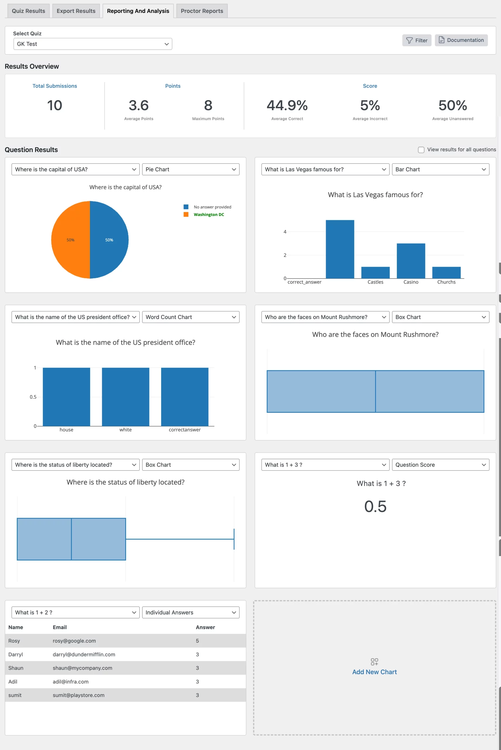
By default, you will be shown custom charts that you’ve previously created. If you to create a new custom chart click on the blank box that says “Add new chart” and then select the question and its corresponding chart from the drop-down.
For a graded quiz, the Pie Chart now highlights correct answer text in green color making it easy for the quiz admin to spot correct answers, as seen in the above example.
To export any graph as an image, hover over the image to see a camera icon appear in the top-right corner. Click on the camera icon to download the image. To switch between various charts & graphs click the “Select a Chart” dropdown you will get various graph & chart options. You can use these to switch between types of charts. By clicking on the “Bar Chart” button, the data will be plotted in a bar chart. To remove a particular chart, hover over the chart you want to remove and click on the red cross icon.
You can also use the “Word Count Chart” button to use the data in a word count chart. This is useful if you have an open answer type of question and want to see the most used words.
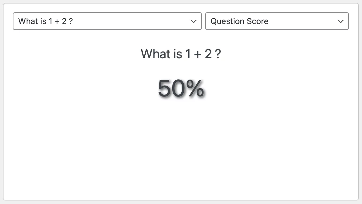
For question types of “Multiple Response”, you can choose the “Multiple Response Chart” button to see the individual answers graphed and click on the “Question Score” button to see the average score earned for that question. Using this data, you can quickly see what questions users have the most trouble with. Lastly, the “Individual Answers” button will show you all of the answers provided for that question. This is useful for quickly looking through answers to open answer questions.
Display Charts on Results Page
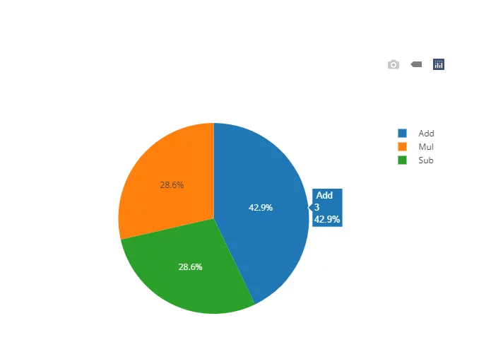
Display Quiz Results as Pie Chart
To display the Quiz/Survey results to the user in the form of a Pie Chart after they submit the Quiz, you need to add the below code in the Results Pages of your Quiz/Survey. Note: It will work for multiple-choice question types only
%QSM_PIECHART_RESULT_QUESTION_ID%
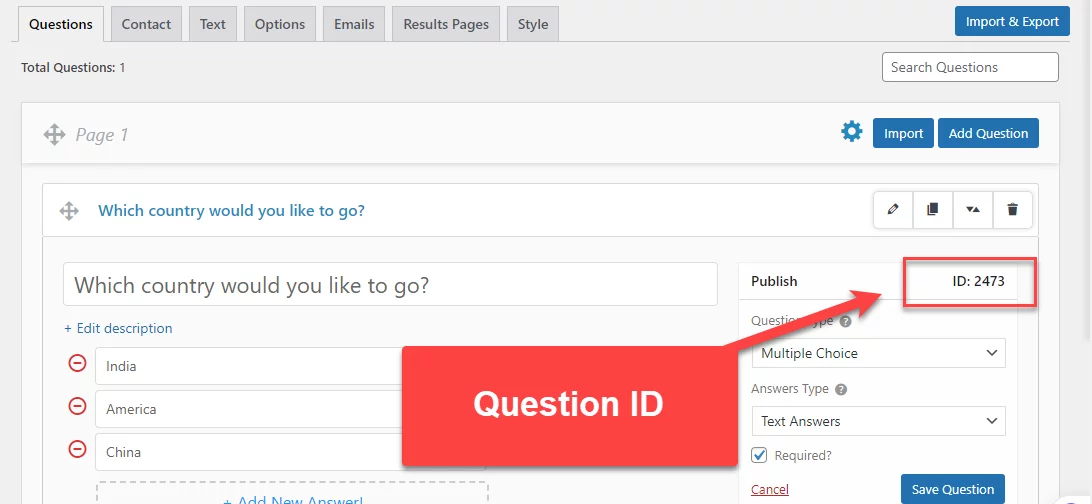
You need to replace QUESTION_ID with your Quiz’s Question ID and hit the Save Button. The Pie Chart will be displayed with the Percentages on them.
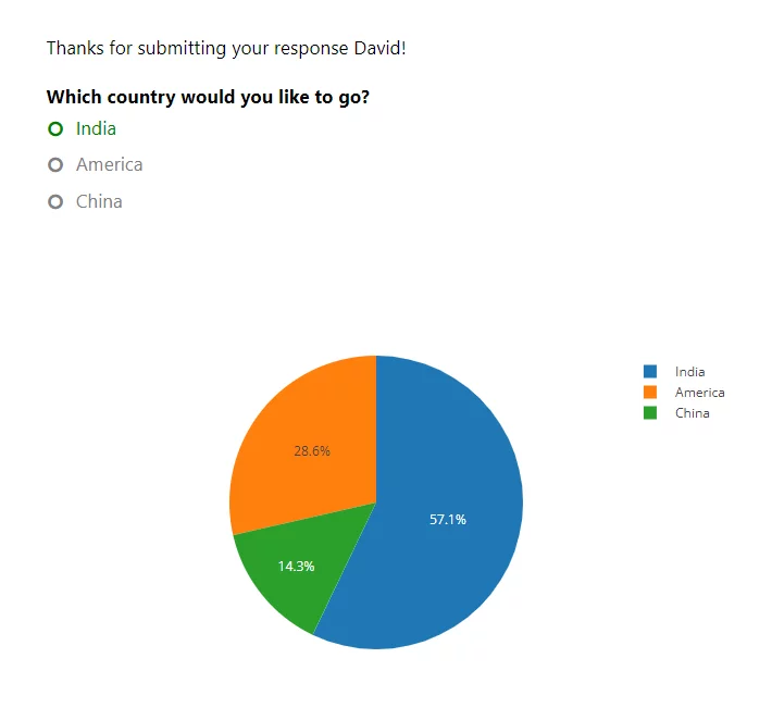
Display Quiz Results as Pie Chart with Category Points
Use the below variable to show category-based points earned by the user on the results page with a Pie Chart.
%CATEGORY_POINTS_PIECHART%
Display Quiz Results as Bar Chart
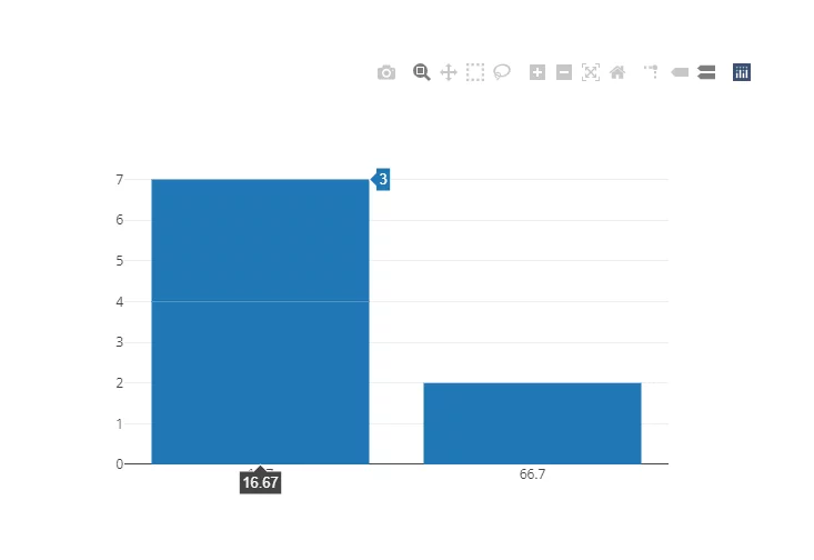
To display the Quiz/Survey results to the user in the form of a Bar Chart after they submit the Quiz, you need to add the below code in the Results Pages of your Quiz/Survey. Note: It will work for multiple-choice question type only.
%QSM_BARCHART_QUESTION_ID%
You need to replace QUESTION_ID with your Quiz’s Question ID and hit the Save Button. The Bar Chart will be displayed with the appropriate data.
Display Quiz Results as Bar Chart with Category Points
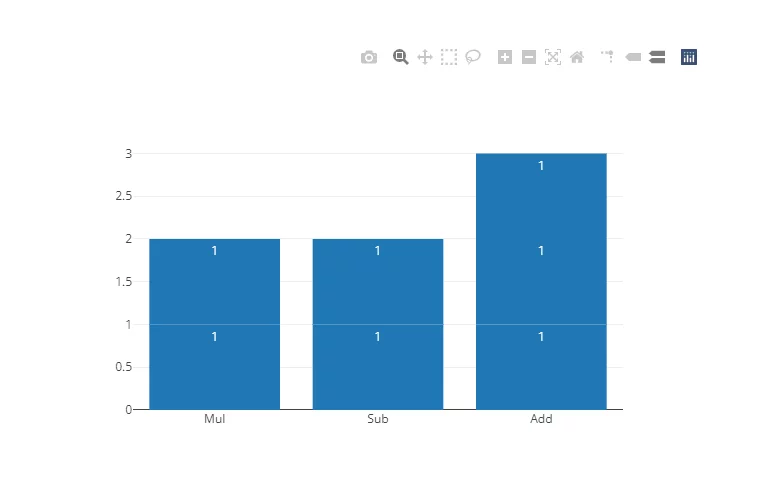
Use the below variable to show category-based points earned by the user on the results page with a Bar Chart.
%CATEGORY_POINTS_BARCHART%
Calculation of percentage per question

The Reporting and Analysis addon now includes a pie chart option that displays the percentages of correct and incorrect answers. This chart offers a clear visual representation of quiz performance, with interactive hover functionality that reveals the exact count of quiz takers who selected correct or incorrect answers. This feature aids in quick and efficient analysis, helping quiz administrators identify trends and make informed decisions to improve quiz content.
If you have any trouble implementing the Reporting and Analysis Addon or have more questions about the process, please fill out a support ticket by going to the WordPress dashboard and selecting ‘help’ in the QSM plugin and our support guru will be able to help you.


