The Contact tab in QSM enables you to configure a form for collecting user contact details within quizzes or surveys. This feature supports multiple field types and customization options to define a signup form tailored to your data collection needs.
Set up to Configure the Contact Tab
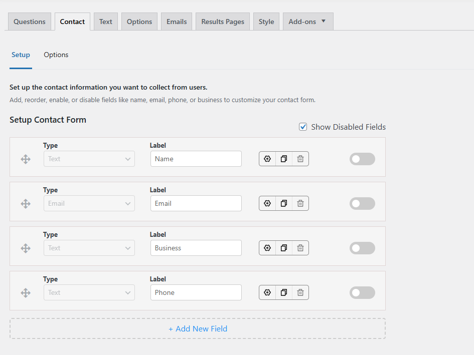
1. Contact Field Type
When adding a new field in QSM, you can choose from 8 types of contact fields:
- Text: Collects general input, such as names, businesses, or phone numbers.
- Email: Allow input of a valid email address.
- URL: Collects website addresses or other URL links.
- Number: Accepts only numerical input, ideal for phone numbers, student IDs, or similar data.
- Date: Gathers date information, with customizable format options available in the Options tab.
- Checkbox: Allows users to confirm choices, like agreeing to terms and conditions.
- Radio: Provides a single-choice selection, such as choosing a gender or preference.
- Select: Adds a drop-down menu; you can enter the list options (separated by commas) in the Settings icon > Options.
📌 Note – QSM includes four built-in contact fields: Name, Email, Business, and Phone. These fields are initially disabled, so you need to enable the ‘Show disabled fields’ option to view them. You can customize their labels to suit your needs, but their types are fixed and cannot be changed. Additionally, these fields are permanent and cannot be deleted.
2. Label
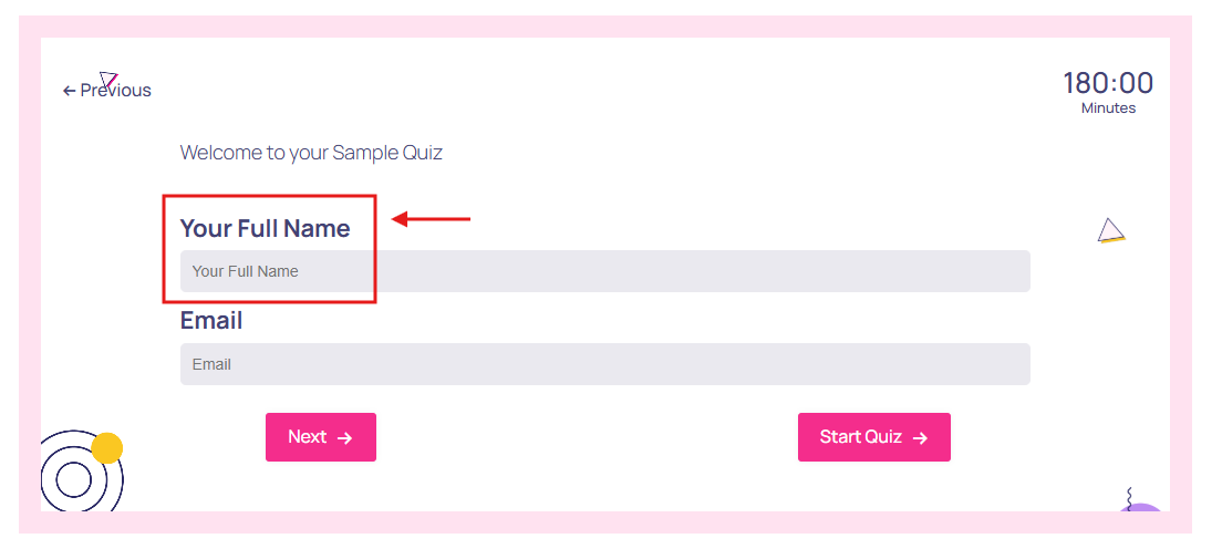
This field provides you the ability to customize each type with a particular label that will be displayed in the contact form before the text input field.
For example, if you enable the toggle button of the ‘Name’ contact field, you can customize its label, let’s say –‘Your Full Name,’ participants will see ‘Your Full Name’ followed by a text box in the quiz.
3. Settings
Various settings are available based on the selected contact form type.
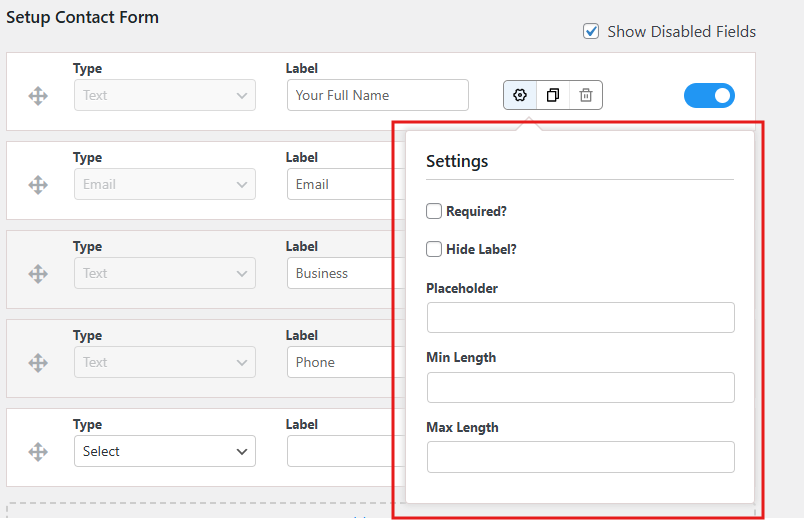
- Required: If checked, the field must be filled in before the quiz or survey can be submitted.
- Hide Label: Lets you hide the set label with just the placeholder text visible
- Placeholder: Set the placeholder text that will be shown inside the text field
- Min Length (For Text & Number Types): Set the minimum number of characters or numbers the input must have.
- Max Length (For Text & Number Types): Set the maximum number of characters or numbers allowed in the input.
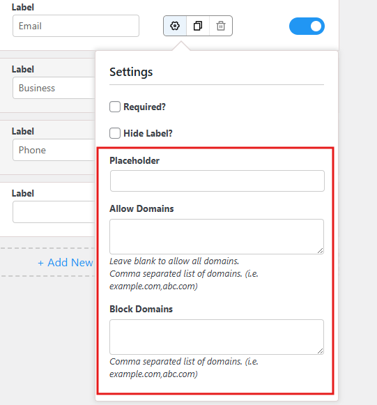
- Allow Domains (For Email Type): Enter a comma-separated list of email domain extensions allowed for input. Leaving it blank allows all domains.
- Block Domains (for Email type): Enter a comma-separated list of domains blocked for input
- Options (For Radio & Select Type): Enter all the options for the selection to be separated by a comma
- Make the first option the default selection (Select type) – If enabled, the first option added in the select type field will be selected by default.
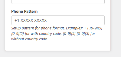
- Phone Pattern Validation – Under the Phone label field settings, you can configure the phone pattern format. If quiz takers enter their mobile details in a format that doesn’t match your pattern, the entry won’t be validated.
For example, if you enter the specific format like “+1 XXXXX XXXXX” and a user doesn’t add the country code, it will not be validated.
4. Duplicate Field
Click the “Duplicate” icon to create a copy of a contact form field.
5. Delete Field
Click the “Delete” icon to remove a field.
6. Enable/Disable Field
To add a field to your quiz or survey contact form, enable it by toggling it on. To exclude all contact fields, leave them disabled by keeping them toggled off.
7. Show Disabled Fields
When the “Show disabled fields” option is enabled, you will see all the disabled fields. However, if you disable the option, all the fields that are toggled off will be hidden, and only the enabled fields will be displayed.
8. Add New Field
Click on the Add New Field button to include more fields for the contact form.
Configure Options Tab
From the Options tab, you can configure more preset options that allow you to control how and when the contact form is shown to the users and manage its behaviors.
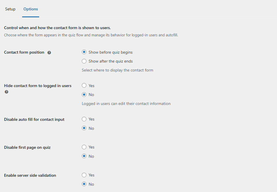
- Contact form position – Choose when to display the contact form in a quiz or survey. Either you can show it before the quiz begins or after the quiz ends.
- Hide contact form to logged-in users – Select whether to display the contact form to logged-in users or not
- Disable autofill for contact input – Select whether to allow auto-fill in the contact input field or not.
- Disable the first page on quiz – You can choose whether to disable the first page (welcome page) in the quiz or not. If you disable it, then the quiz will be displayed directly to users.
- Server-side validation added for contact form fields – The QSM Contact Form includes browser & server-side validation to ensure all contact field inputs meet set requirements. Validation covers the following:
- Required fields
- Minimum length
- Maximum length
- Allowed domains
- Blocked domains
The image below shows the default browser validation message👇🏻
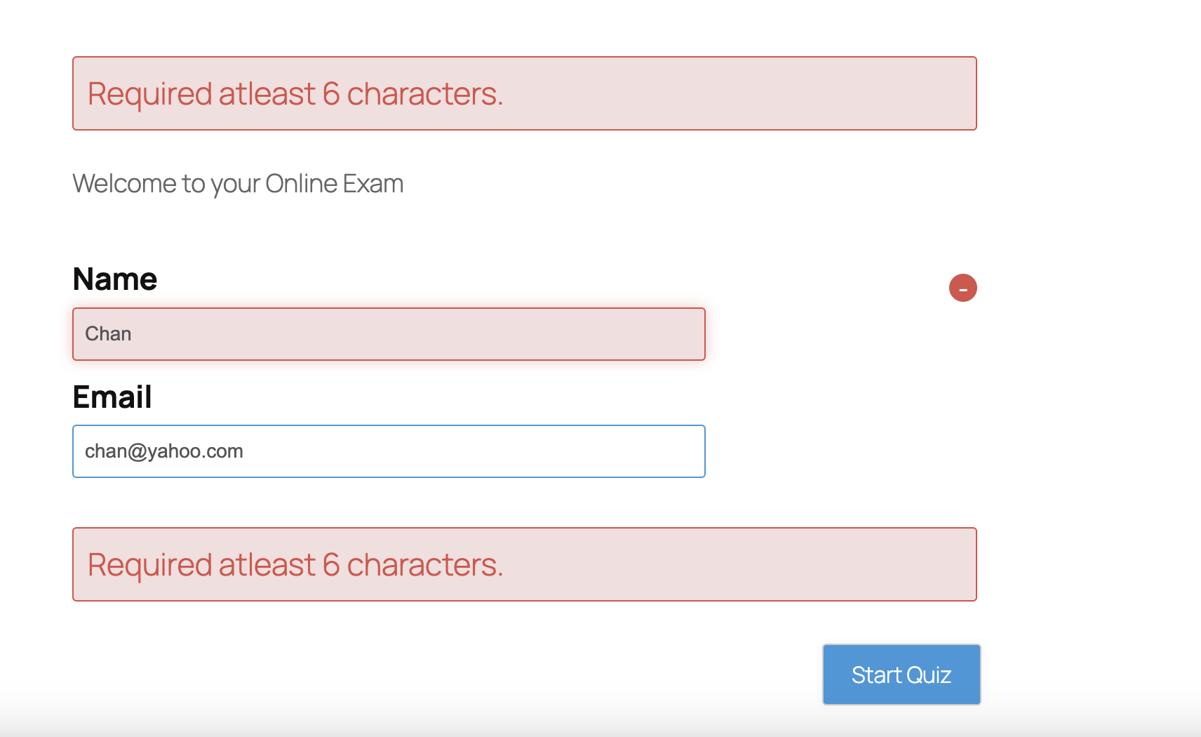
By default, server-side validation is disabled. To activate it, the user must explicitly set the ‘Enable server-side validation’ option to Yes. Once enabled, participants will receive an error message upon submitting the quiz if any input fails to meet the specified criteria.
The image below is the validation message you get from the server when submitting the quiz. 👇🏻

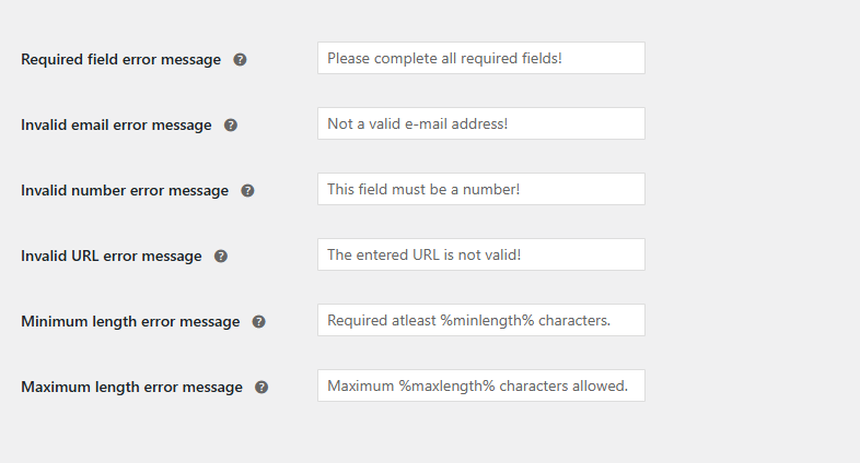
1. Required field error message – Customize the error message displayed when a required contact field is left empty
2. Invalid email error message – Customize the error message displayed when an invalid email is entered in the contact field.
3. Invalid number error message – Add a custom error message that will be shown when an invalid number is entered.
4. Invalid URL error message – Add a custom error message that will be displayed when an invalid link is added.
5. Minimum length error message – Customize the custom error message for when the minimum length is not validated. Use %minlength% for the number.
6. Maximum length error message – Customize the custom error message for when the maximum length is not validated. Use %maxlength% for the number.
After adding and adjusting fields as needed, remember to save your work by clicking the “Save Form” button located below the Form Options box.


