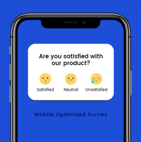
Did you know that a mobile-optimized survey is ranked higher by Google? Mobile browsing takes more than 50% of digital media time and there is a high chance that your surveys can be performed on mobile. And that’s why it is important to consider mobile users while creating a survey.
Quiz and Survey Master is a WordPress survey plugin that helps you create an amazing mobile-optimized survey. It has various options that can be used to improve your surveys and create engagement.

Here, in this blog, we will show you what you should keep in mind to make a mobile-optimized survey.
What Is a Mobile-Optimized Survey?
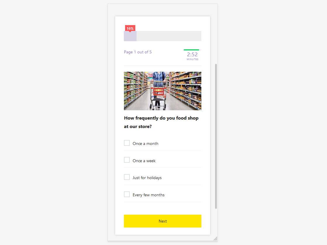
A mobile-optimized survey is a survey that is compatible with and responds to mobile devices like smartphones and tablets. These surveys are adaptable to smaller screens. The buttons and form inputs are extremely mobile-touch friendly.
Why Should You Make a Mobile-Optimized Survey?
If the survey is not mobile-optimized, the users who take surveys on mobile may find it difficult to use and would be likely to close it without responding. So it is important to design a study that a participant can easily read, navigate, and understand even on mobile.

Since the mobile media time is higher, you can reach a larger audience. And that makes it even more important to design surveys keeping mobile respondents in mind.
How to Make a Mobile-Optimized Survey?
1. Use a Responsive Theme
Your surveys might look great on a desktop, but if you do not make them adaptable for mobile, you might lose a large audience and business as well. Use a responsive WordPress theme that is capable of adapting content to multiple screen sizes. Quiz and Survey Master is also responsive and works for all computing devices.
With your mobile-optimized responsive theme, you don’t have to run a custom mobile site along with your desktop site. Responsive themes make it easy and show the optimized content concerning the screen size.
Exponent is an attractive, lightweight, multi-purpose Business WordPress Theme with a fully responsive fluid layout that works beautifully on mobile devices and desktops alike.
2. Use Plugins for Mobile-Optimized Content

If you don’t want to go for a responsive theme, WordPress has a handful of plugins that can make your mobile-friendly surveys. Since Quiz and Survey Master is a responsive plugin, use QSM to make a mobile-optimized survey.
3. Vertical Columns for Multiple Choices
While formatting your surveys to make them mobile-optimized, it is better to opt for vertical multiple responses. Horizontal formatting may produce text wrapping and users might feel difficulty in understanding.
One vertical column is the easiest reading experience you can give to your respondents. The better experience you give, the better data you get for analysis.
4. Don’t Use Full-Screen Pop-ups
Full-screen pop-ups that contain CTA for your website, might work for desktop users but can be annoying for mobile users. Hiding those popups for mobile users might cut down their frustration and therefore provide them with a better user experience.
If you need to add these pop-ups for mobile users, consider adding some CSS or Javascript code. This will identify users’ browser type and will avoid showing the popups to the people browsing from mobile.
5. Keep It Short
You don’t want to bore your users with long surveys. This might lead to irrelevant data and users might drop halfway. Respondents taking surveys on mobile are likely to take the survey on the go.
Since there is limited space on the mobile screen, make sure the surveys are short and simple, keeping in mind the importance of your user’s time.
6. Avoid Unnecessary Dropdowns
Using too many drop-downs isn’t a good option for mobile surveys. It is harder for respondents to read on mobile devices since they have to click it and scroll to see all the answers.
There are chances that respondents might not see all the options and scroll through them quickly, which could bias the response.
7. Don’t Clutter Your Screen
Using big images and big logos might work for desktop users, but would be a headache for mobile users. Since you are making a cellular phone survey, try to keep them as clean as possible.
The large image might slow down the loading of the survey on mobile. So, add images that respond to the mobile screens.
Conclusion
These are some important things to take care of while making a mobile-optimized survey. As more and more people use their mobiles and tablets to take surveys, use these tips and make sure that your surveys are ready for mobile users.
QSM also has a QSM Pro Bundle that has various add-ons to optimize your survey and make it user-friendly. These add-ons save a lot of your precious time and make the work easy for you.


