QSM Sapience theme provides a sleek and intuitive interface for creating professional-grade quizzes, online tests, questionnaires, exams, and survey forms. It’s mesmerizing design and customizable options allow you to create visually appealing quizzes and surveys to engage your audience.
One of the standout features of Sapience is its circular progress bar with a page number indicator, which helps users track their progress throughout the quiz or survey. The Sapience theme can be installed on sites with QSM Core v8.1.8 or higher.
Circular Progressbar
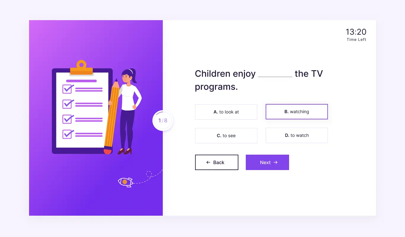
The Sapience theme’s circular/radial progress bar is surely the centerpiece star attraction. It sits in between the global featured image and the quiz area. A thin circular progressive line that advances slowly as quiz pages are changed. At the center you find the pagination denoting the current page number out of the total number of quiz pages remaining to be answered.
The progress bar will be enabled by default, but if it’s still not visible you can enable it from Options Tab > Display > Show progress bar and enable the “Show current page number” option too.


Multiple Answer Label Types
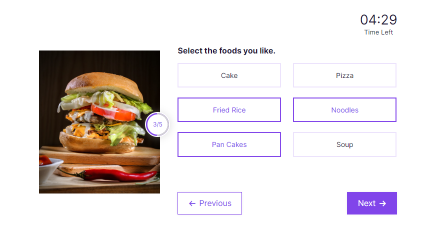
Sapience Theme has a unique feature that enhances the visual appeal of your answer choices and makes them more engaging. The option to choose different Answer Labels is a feature unique to the Sapience theme, you can select between Numbers, Alphabets, and the default icons (radio or checkbox) label options. Using appropriate labels will assist the user in answering the question easily without guessing about the chronology of the answers. These labels will be displayed before each answer.
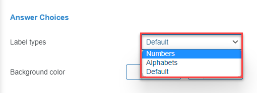
You can change the Label Types from Theme Settings which can be found under Answer Choices.
Fixed Featured Image Space
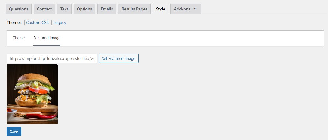
The Sapience theme has a dedicated and fixed global featured image area making it one of the highlights. The featured image is placed on the left of the quiz with the questions and answers on the right. This featured image can be set from Style > Themes > Featured Image. Once you set the global featured image it will be visible on all quiz pages.
It makes sense if your quiz is based on a specific subject/topic so you can match it with the questions being asked in the quiz.
Adding Featured Images
Sapience theme by default allows you to add 2 types of featured images
- Global Feature Image – Seen at the beginning of the quiz & is displayed at the very beginning of the quiz in the front end. If you skipped adding a featured image at the initial quiz configuration you can still add it from Style Tab > Featured Image > Set Featured Image.
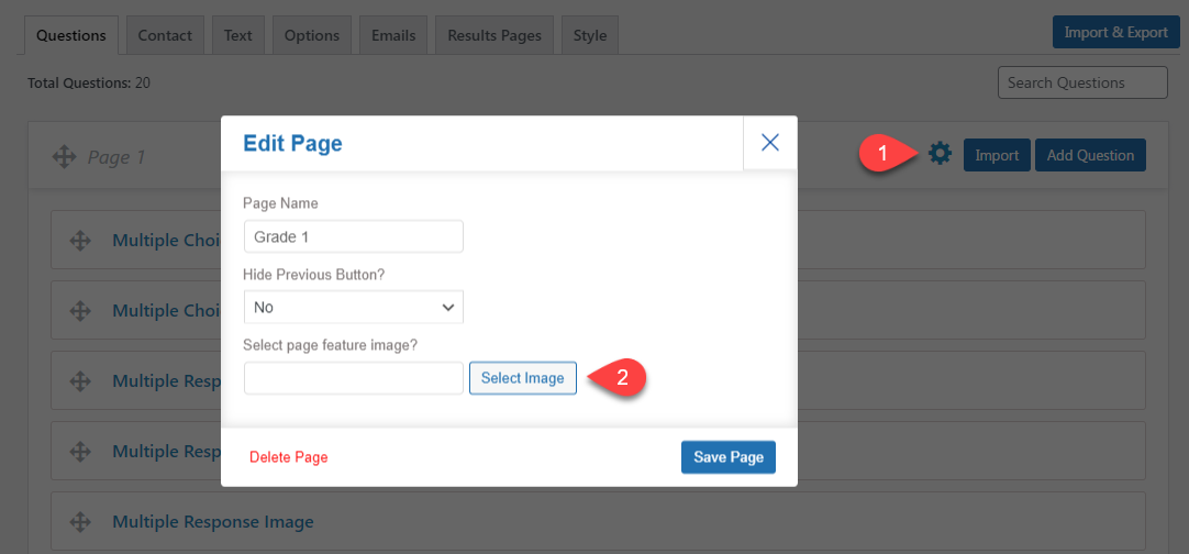
- Page Level (Theme-Specific) – With the Sapience theme, you can even add individual featured images on all quiz pages, a feature that’s unique to the Sapience theme. To add featured images to each quiz page just click the gear icon of the quiz page > ” Select page feature image?” and then set the image. Page Level Featured images will go to the right side of the quiz on the front end.
Effects of Manual Pagination vs Auto Pagination on Featured Images
In QSM auto-pagination (questions per page) is set to 1 and is enabled by default. We recommend you go for Manual Pagination and set the “questions per page” option to 0 by going to Options Tab > Display.
If Auto-pagination is Active, Global Featured Image will be seen only on the first quiz page, however, if you go for manual pagination and set the questions per page to “0”, the global featured image will show on those quiz pages that are missing “Page Level” featured images.
So, it’s recommended to set the Global Featured Image first and then if required set the Page Level Featured Image on your quiz.
Theme Customizations
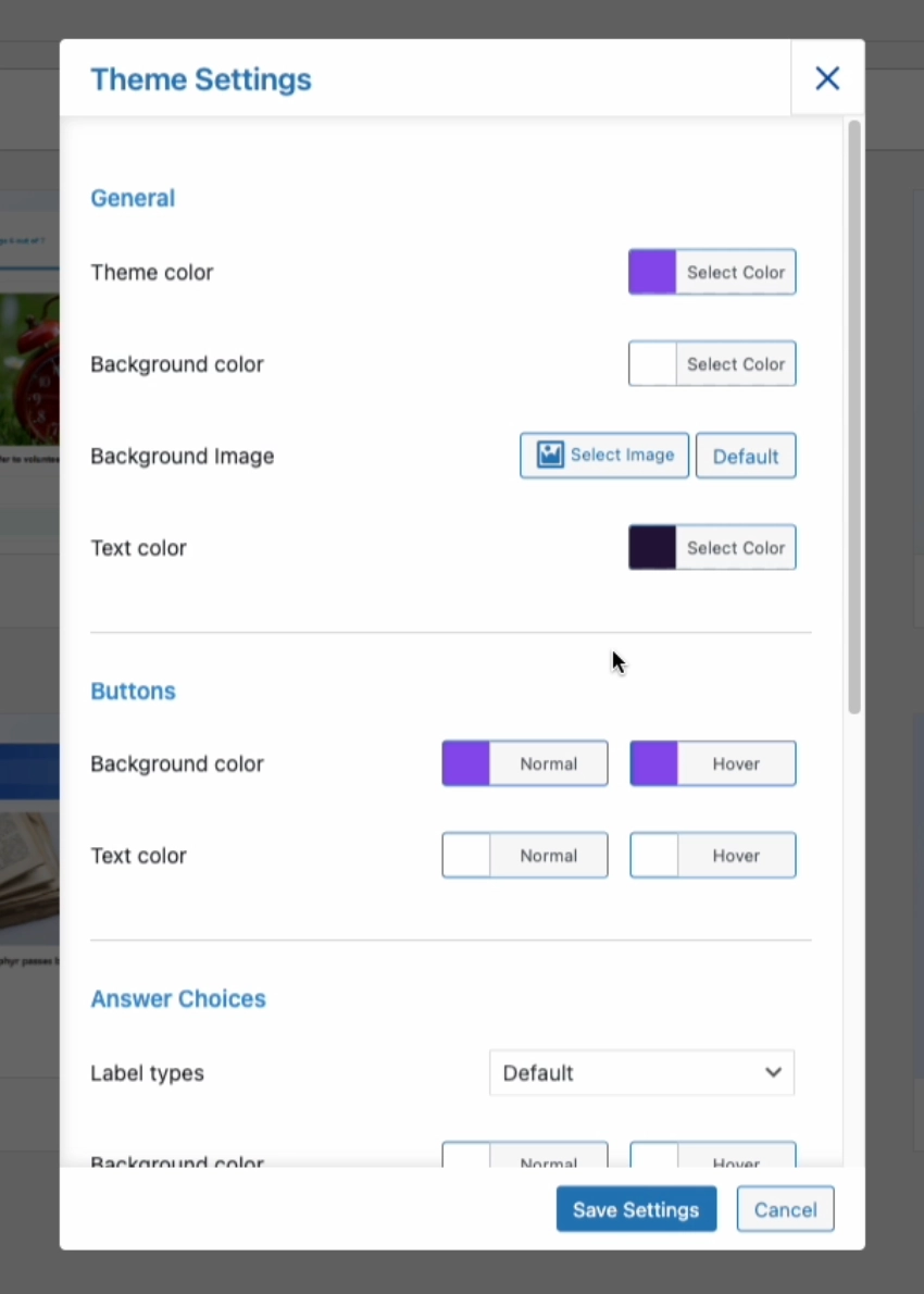
You can customize the Sapience theme by navigating to Style Tab > Themes > Sapience > Customize
Want to change the theme’s colors, background color, and background image? buttons & text color or the background colors? Answer Label Types and Progressbar color, etc. You can control it all from the Theme Settings. Each theme component can be customized as mentioned below.
- General – Allows you to change the Theme’s color, Background image/colors, and text colors
- Buttons – Allows you to change Button color and button text color
- Answer Choices – Allows you to change Answer Choices colors. One unique feature of the Sapience theme is that it allows you to customize answer label types using Numbers, Alphabets, or default icons. Simultaneously you can change the background color, text color, and the option border colors of the answer choices which again are unique to the Sapience Theme.
- Progress Bar – Allows you to change the Progress Bar colors
- Advance Settings – Selecting the timer format between HH:MM, MM:SS, or HH:MM:SS (Note: Make sure that you have set the quiz’s time limit in Quiz >Options tab >Quiz Submission >Time Limit (in minutes)) and Enabling the Per Page Label.
Note: All the colors that you change can be brought back to their default values by hitting the “default” button found inside the color picker.
📌 QSM core plugin and themes now fully support the RTL (Right to Left) language format. Benefit from improved usability for right-to-left language users.
A Visual Breakdown
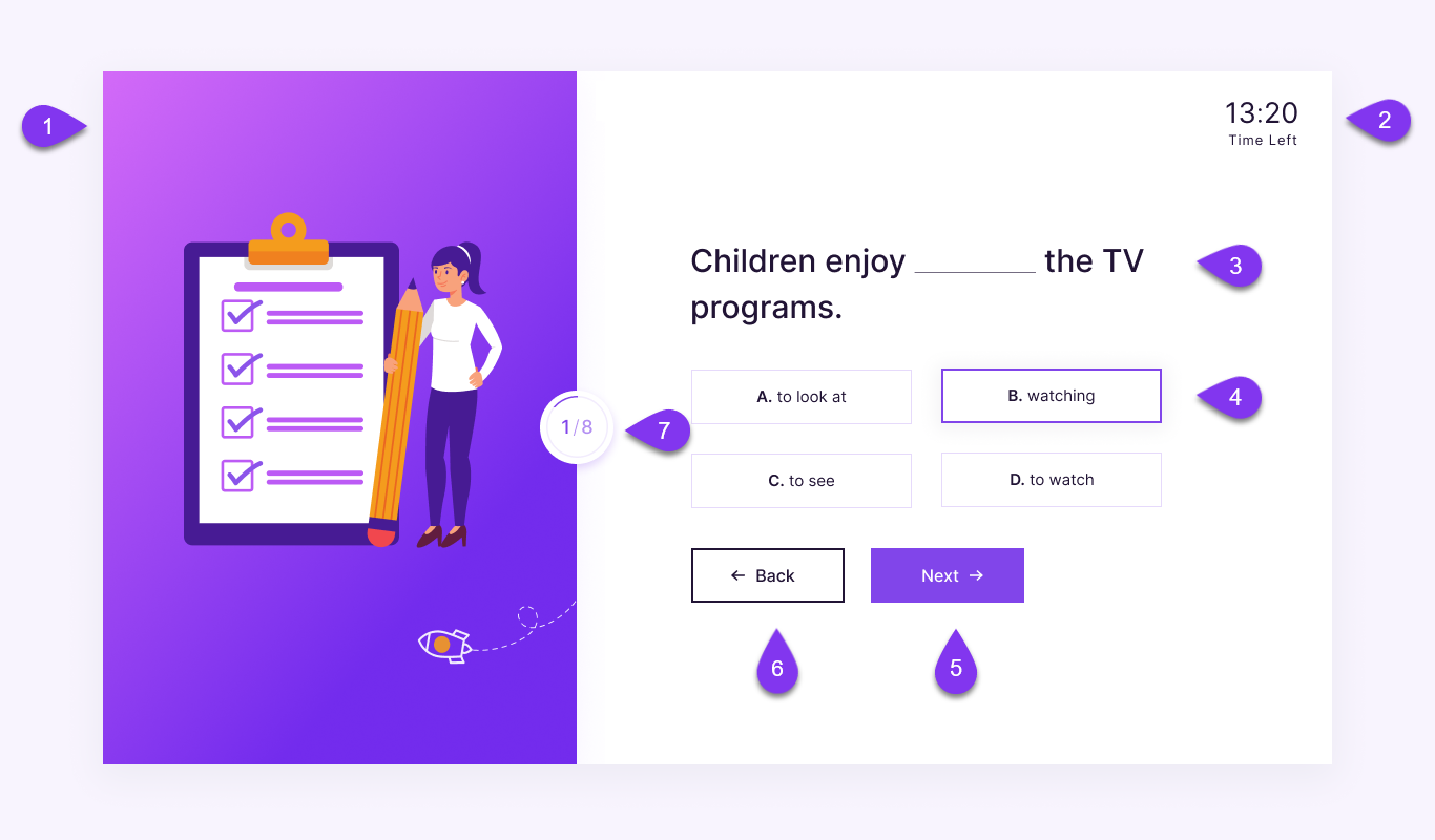
- Featured Image – If you have set a global featured image in your quiz, then the featured image will be displayed on the left of your question. Global featured images can be added from Style > Themes > Featured Image.
- Timer – If you have set a time limit for your quiz from the ‘Options’ tab, you will see a beautiful countdown timer at the top-right of the quiz area.
- Question – The set question from the question tab will be displayed opposite the global featured image, based on the pagination option set in the options tab the questions will be displayed one after the other.
- Answers – Depending on the question type you choose the answers will vary, however in the Sapience theme you will find the multiple choice answers in full-width rectangular buttons having sharp edges with box icons. You can change the hover color from Theme Customization.
- Next Button – In the Sapience Theme, the Next Button is located at the bottom-right of the form. You can change the button color from Theme Customization.
- Back Button – The Sapience theme’s back (previous) button is located opposite the Next button.
- Progress Bar – In the Sapience Theme, the progress bar is circular. It’s placed in between the featured image and the question form. It displays the progress of the form along with a circular fill. The progress bar also houses the page counter which helps the user know the current page number and the remaining page count. You can change the Progress bar color from Theme Customization.
If you have included the ‘polar’ question type in your quiz, you will see a unique arrow slider icon in your quiz, which later displays the value of the slider according to its rested position.


